LOGO
Website Design + Development
We also designed a brand-new website with bold styling, working in dynamic brand elements such as colored polygons, geometric background patterns and fun iconography. The Impact page adds movement through roll-up statistics micro-animations. The site clearly defines its value proposition and the services they offer to other nonprofits. Developed on WordPress, the site allows the staff to edit content themselves to keep costs low. The new website allowed them to clearly communicate their mission and services and as a result attracted a large new donor from out of market.
Branding
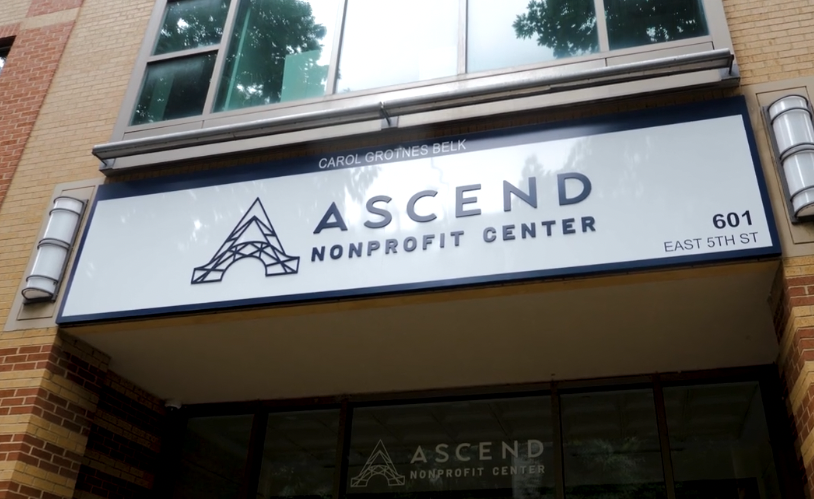
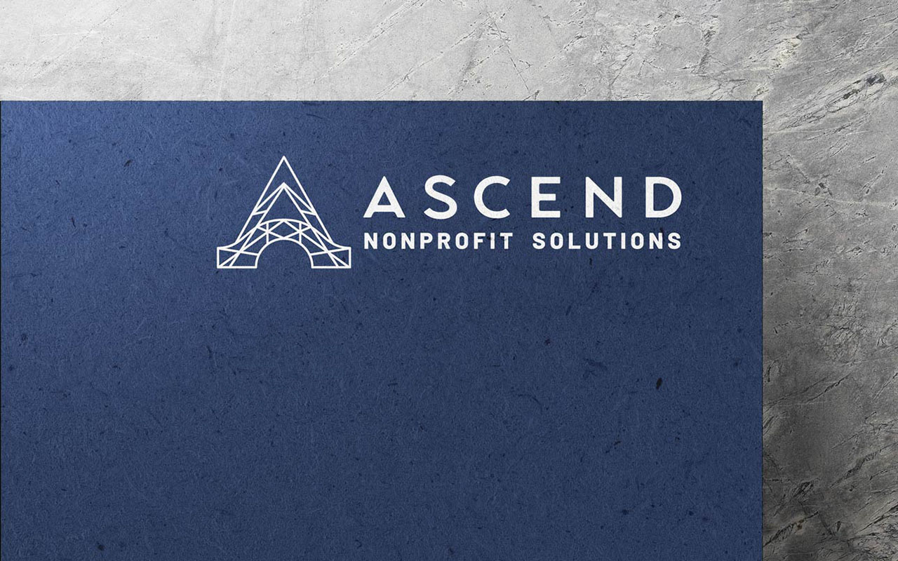
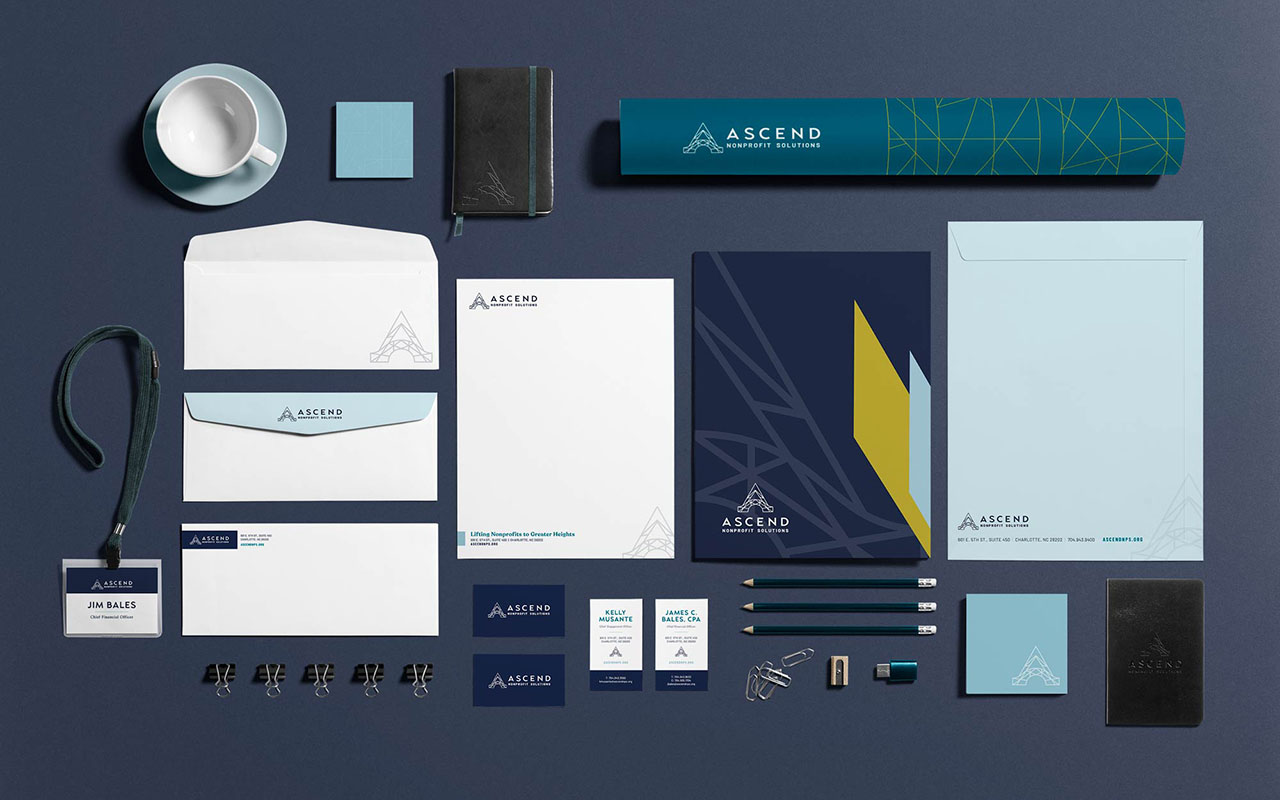
We designed a fresh new logo in which the icon symbolizes a bridge for support, solutions and stability. Ascend allows nonprofits to soar and reach new heights in their efforts, bridging the gap between their mission and impact. The intersecting lines of the icon represent the connection between the nonprofits and the community. The bold font, paired with the geometric icon, is modern and professional while remaining welcoming and trustworthy.
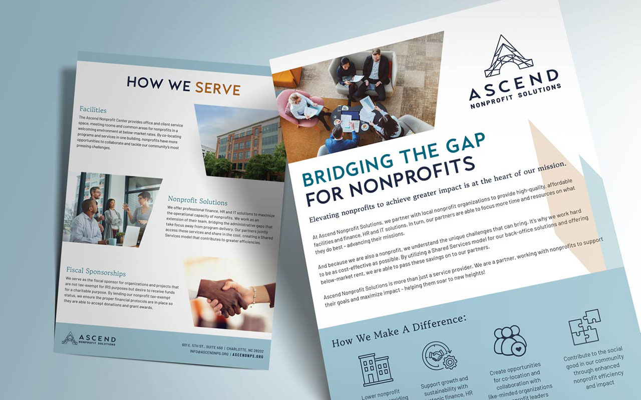
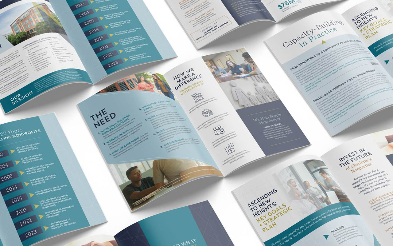
Once the client chose the final logo and approved new brand messaging, we designed brand standards so internal staff had the tools to create complementary graphics that stayed within the brand guidelines. We also designed a stationery suite, a concise one-page flyer, a contemporary case for a support deck they can send to potential donors, and finally inserts communicating capabilities to nonprofits who may use their services. The case for support outlines their impact and value proposition clearly through impactful graphics and iconography.
