Brand Discovery
We hosted a discovery kickoff and brand audit with several members of the OCPC staff and talked through the challenges with the name and the current logo and led them through developing an elevator pitch, clarifying their mission and identifying their target audience. Following the discovery meeting, we interviewed other stakeholders to get their input, including board members, volunteers, community partners and past employees.
We came up with nearly 100 names and tested the staff’s top three choices with Onslow County residents through a market research survey and paired each name with a tagline that would provide more context for the organization. Ultimately, the top choice was “One Place: Creating Hope for Families.”
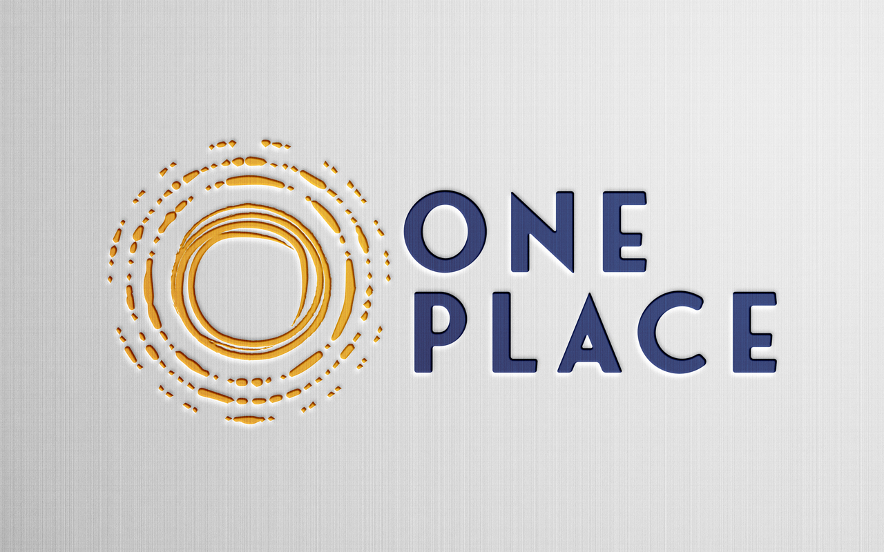
Once the name was decided upon, we moved into logo design. We developed a variety of logos that represented the hope the organization provides to the community. The logo they chose incorporates a sun icon in the shape of concentric circles, representing the ripple effect of how helping a family can make waves of change in their lives and in the community over time. The circular icon also symbolizes a warm embrace and the creation of a safe space.
LOGO

WEBSITE DESIGN & DEVELOPMENT
Beyond just updating the branding, One Place wanted us to reorganize its website to make it more user-friendly to help people find information, rewrite some of the content and implement the inspirational new branding. The homepage design needed to make it clear that One Place’s priority was young children and setting them up for success. Once the website was built and approved content was input, our interactive team tested the site for usability, accessibility compliance and mobile friendliness.
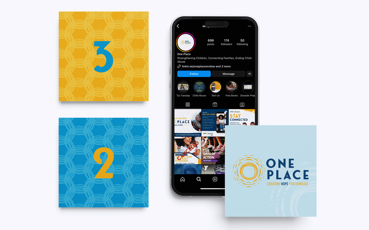
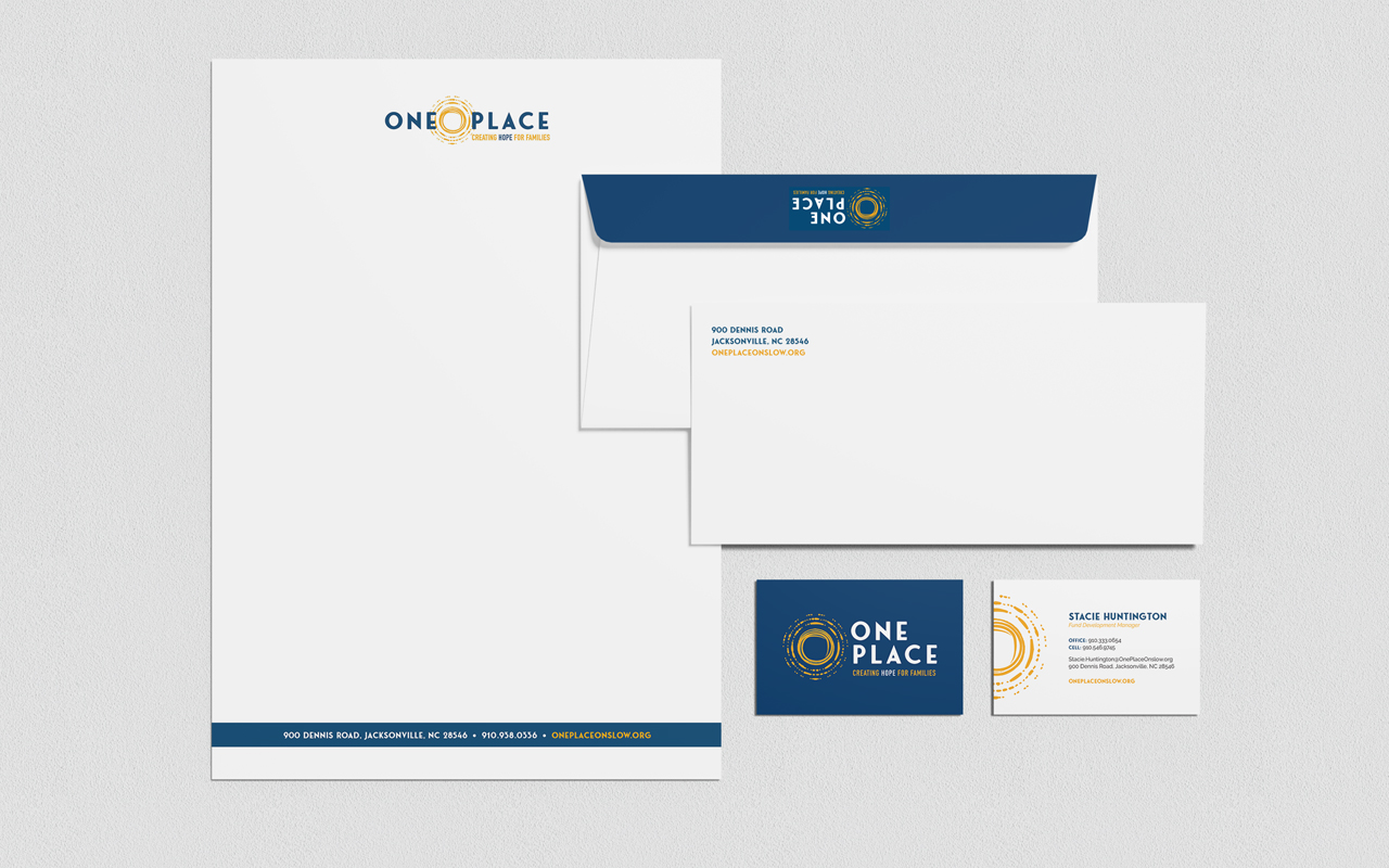
We coordinated the launch of the website with the announcement about the new name and brand for One Place. This included social media posts and graphics, a press release that was sent to local media, business cards and stationery that we designed and printed in advance, and new signage.
