I’m Laura Wyatt, the Web/Interactive Manager at Yellow Duck Marketing. Admittedly as a web designer and developer, I’ve definitely chosen a certain product or favored an organization more based on their website, but how about the “average” person? About 38 percent of people will stop engaging with a website if they think the content or layout is unattractive *cringe*. That’s without reading ANYTHING about you or knowing what services are offered at all. That’s like, not even letting me speak before deciding you don’t want to see me again!
Let’s discuss what those users could see in order to make them stick around a little longer and give you and your company a chance…
AT FIRST GLANCE
RESPONSIVENESS
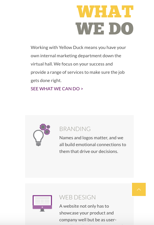
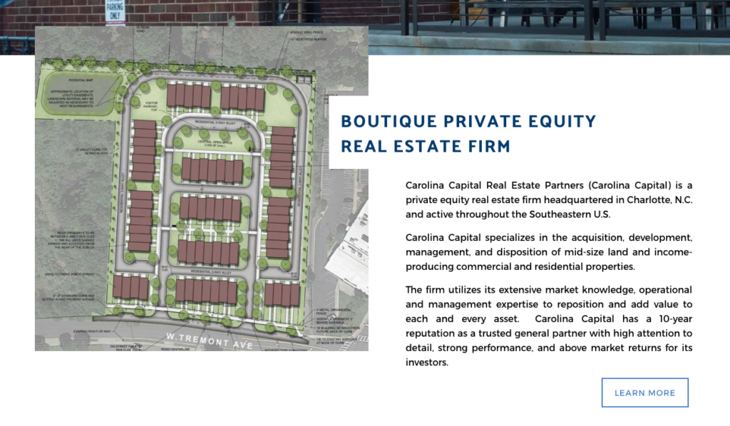
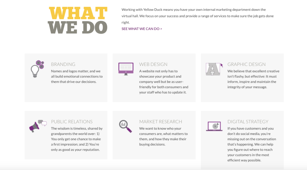
By now, I’m sure you’ve heard the term “responsive” thrown around. This just means that your website is built to work on a variety of device sizes. iPhone, wide-screen desktop and everything in between. In today’s age of “go-go-go,” it’s imperative that your website be mobile-friendly. And that doesn’t mean shrinking the site down to fit a small screen. A responsive website will “reconfigure” the content to adjust to a smaller screen. You can even choose to eliminate content if it’s not essential to your mobile online experience. The bottom line is — if it’s not easy to use on your phone, chances are, users will leave as quickly as they arrived. Also, Google announced in 2015 that they would begin penalizing sites that weren’t considered mobile friendly.
[one][two_third]
DESKTOP VIEW[/two_third]
[one_third]
MOBILE VIEW[/one_third][/one]
LOAD TIME
We’re in the age of instant gratification. Did you know that most users expect a website to load in 2 seconds or less? This means cutting down on image file sizes and maybe even eliminating some content for mobile to ensure your website can pull up quickly with a mobile or desktop connection!
AESTHETICS and APPEARANCE
Not only should a website be visually appealing, but its content shouldn’t be too overwhelming. Be sure that your contact information is easily located.
ACCESSIBILITY
To ensure that all audiences are able to access your website, add alt text to images for those who are visually impaired and may require screen readers. Consider enlarged font sizes if you’re targeting an older demographic.
YOUR GREETING AND INTRODUCTION
COMPANY MESSAGING
What do you want your potential clients or contacts to walk away with? What should they know about you? What sets you apart from your competitors? This is your chance to present your brand message to potential clients, so make it clear, efficient and honest.
TARGETING
It’s important to be sure you’re reaching your ideal clientele or demographic. Tailor your “voice” to what speaks to them and what they would find attractive and most easily understand.
Ok, Now we’re GETTING TO KNOW EACH OTHER…
CONTENT FORMATTING
As I touched on previously, we’re not in the business of waiting around, which means that web content shouldn’t be a novel. Short paragraphs with short sentences and bulleted lists are going to be the best way to let users quickly digest your content.
SITE ARCHITECTURE
Not only should the page layout be concise and easy to navigate, your website architecture should be, too. We’re all about making the online process easy for our users. They should be able to find out more about you, including your contact information and the services you provide, intuitively and without frustration. Having this information readily available in your top-level navigation makes that possible.

USER EXPERIENCE
So much of what I’m saying relates back to the USER and what your potential CLIENTS want — keep that in mind. You’re building a website for them, right? It’s not so much about what we want, but how we want to be perceived and understood by our users. It’s only right that we consider their feelings and experience within our website. This whole idea of empathy and programming our website around it is called UX or user experience. There are several websites that will allow you, for a fee, to submit your website for testing and evaluation it for different types of users. (We love userfeel!) This provides great insight to see what pain points your potential clients may be having with your website and how to fix them!
It was so nice to meet you, LET’S TALK AGAIN SOON!
CALLS TO ACTION
Ok! We’ve met, now what!? Let your user know what the next steps are. “Contact us to set up a meeting” or… “Sign up for our newsletter to stay in touch.” Let them know how they can further this relationship and how to connect with you. Having a call to action on each page, even if it doesn’t look like your typical “call to action” button, will help lead them down that path.

CONVERSIONS
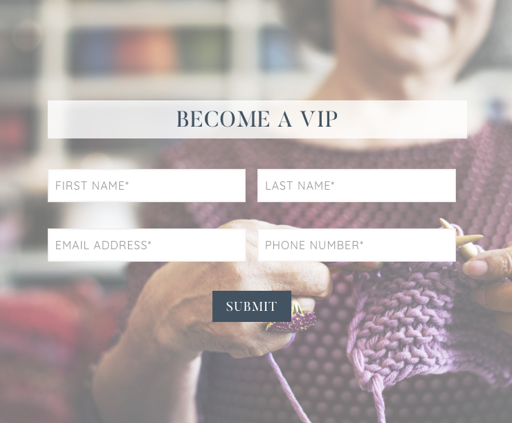
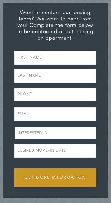
The ultimate goal of a Call to Action is the conversion. Complete the form! Call the number! Register for the event! Make it as easy as possible by ensuring that if you have a form, it’s a short one. Place your company’s phone number at the top of a page, in a header, for example. And for mobile users, especially, ensure that buttons and text are large enough to be clicked with larger fingertips. There’s nothing more frustrating than having to complete a LONG form on your cell phone, or having to click a link within text, but oops! accidentally clicking the link right above it instead. *face palm*.
CONTACT AND FOLLOW UP
Lastly, define a strategy for follow up! If I’ve taken the time to complete a form or leave you a voicemail, I would expect a call or email back within a day. Workloads are heavy and schedules are tight – especially as working professionals, but if we don’t take the time to connect with those who are interested, then we’ll soon find ourselves with a completely clear schedule. *fail*
Does your current website meet these criteria? The ducks are happy to help with a website audit or overhaul. Contact us to see how we can help your website look and perform at its best!
